Monday, May 07, 2007
It's all in how you choose to view it (Artwords #52)

Saturday, May 05, 2007
Artwords #51: Botanical
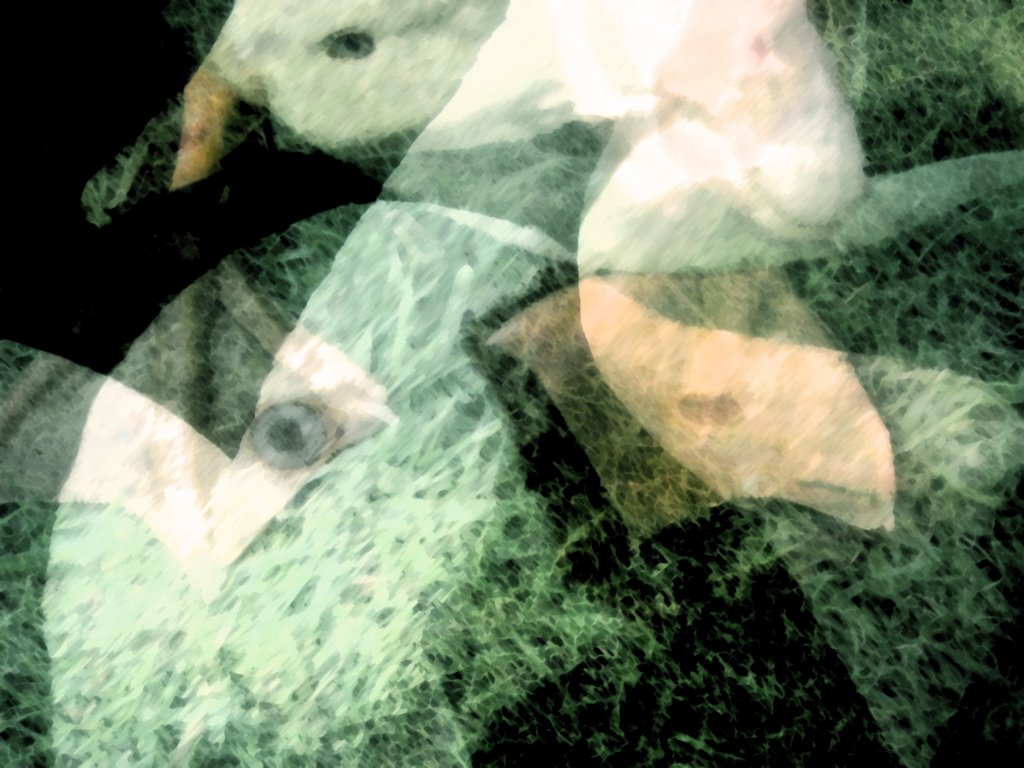
The title for my entry in Artwords this week comes from the fact that the original photo which is the basis of this work was taken in a place called Eden, on the south-east coast of Australia, close to the border of New South Wales and Victoria. Eden is an old whaling town on a rugged but beautiful area of coastline, and it really stays in my mind as a highlight of that trip.
We stumbled onto the town, having not heard of it before but some time later saw a special on ABC TV entitled "Killers in Eden". The following is an excerpt from the cover of the DVD.
"On the southeast coast of Australia, the town of Eden nestles along the shores of Twofold Bay. It was once a center of Australia's thriving whaling industry, in part because it lies along the migration path of baleen whales swimming northward from the Antarctic. But residents say Eden's whalers got some unusual help -- from orcas, or killer whales, that patrolled offshore.
Locals such as Elsie Severs and Alice Otten who witnessed the hunts say the orcas took the lead in the hunt, herding larger migrating whales into the bay. Once the whales were confined in the bay, the orcas would then attack their quarry to the point of exhaustion. Human whalers moved in for the final kill -- then shared the spoils with the orcas."
That story is really just a bit of scene-setting as my image obviously has nothing to do with whales. I stumbled across this bushy area by a lookout and had to stop and take some photos. The tangle of tree trunks, gnarled by the salty winds had created a natural grotto. You can see one of the original images here. I worked on the image in Photoshop, mostly using the adjustment layers and the lighting effects to create this work.
Sunday, April 08, 2007
The Refinery (Artwords #47)
It's great to be contributing to Artwords again after an enforced break. Actually this is the first artwork I've done since returning from Melbourne nearly 2 weeks ago. The whole thing took a bit of a toll on my health and I guess I will have to factor in that sort of recovery period after each trip down this year.
Tomorrow I plan to get back to my masters work but today I took a trip to Wynnum about half an hour from my home and took some photos.
This refinery is on the way back. The whole area is full of "Jeffrey Smart" moments, as my husband pointed out. Wonderful if you like photographing industrial scenery - and I do.
Photoshop is a wonderful way for me to get my creative juices flowing again and I was even able to locate the exact spot to show you on a map on Flickr - great fun! Check it out here: http://www.flickr.com/photos/amandaw-w/450575858/
By the way, there is actually quite a bit of yellow in the sky, it just doesn't show up so well on screen.
Sunday, February 25, 2007
Topic #41 - Morning
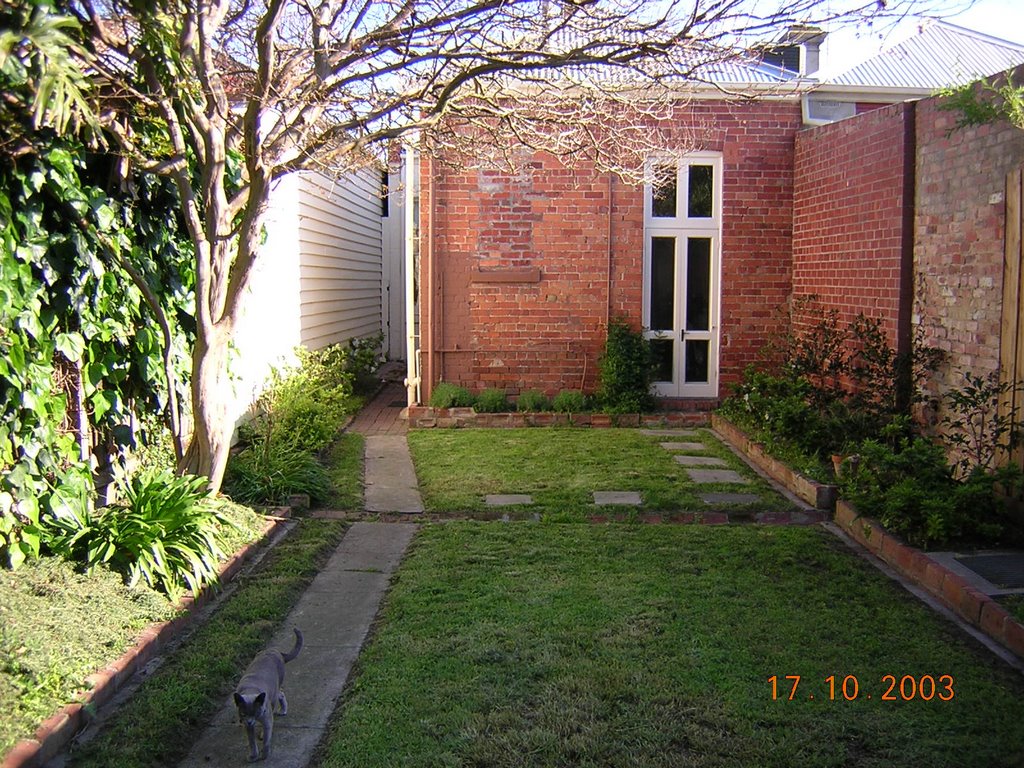
Having CFS has an interesting impact on my photography - I have very few photos taken in the morning, because I simply don't get out of the house till about midday! Hunting through my folders did reveal this one, with the foliage shadows on the washing, taken in Melbourne.Saturday, February 17, 2007
Topic #40 - Heart
With my love of anatomical drawings I couldn't miss the chance to join in this weeks Artwords challenge - Heart. Saturday, February 03, 2007
Topic #38 - Memory

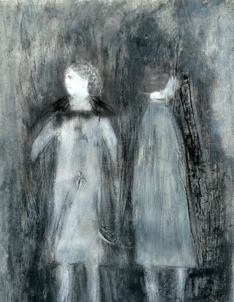
My entry this week is an encaustic painting. This is a medium I am very new to, so I have a lot to learn. Even so, I find working with the wax absolutely fascinating and despite the challenges it presents I experience little or no frustration.
The building up of translucent layers really lent itself to this weeks theme. To me it represents the way memories become fuzzier over time. I started off working quite intuitively, putting down layers and scratching back to reveal hidden textures; then painting more layers of wax.
After a while I started to see a theme emerging of archaic time. The textures seemed geological and the scratching back reminded me of archeological digs. There is also a flavour of the primordial soup, I think. In order to integrate the image, I overlaid some structure in the final layers. Without that, the imagery was a bit too chaotic for my eye. I do hope you can see some of the layering and detail in the enlargement, because without that some of the meaning will be lost.

A Painting A-Day: The Last Week

Tuesday, January 23, 2007
A-Painting-A-Day: Taking Stock So Far

I'd love to be able to say that it was my intention all along to do a big end of month summary of this Painting-A-Day exercise - but the truth is I've been so caught up making art that I just haven't had a chance to update this blog.
The positive of this is that it means the month is going really well. There have been a few changes to the Painting-A-Day "rules" - when you're making it up as you're going along, this is not surprising! First of all, it doesn't have to be a painting. In fact it doesn't absolutely have to be 2-D, although I have tried to stick to this in the main. However, I think that all but 2 works do include paint! Secondly, the daily was never really realistic, unless I wanted to make all the works very spontaneous and quick. Instead I have gone for at least 4 per week and made it to 5 once. By taking it a little more slowly, I think I can get some good "starters" going, things I can return to and look at developing in the future. It also gives me a chance to try out a few different techniques I've thought of or read about in the past 12 months. So the collage above shows pictures of all the works created so far.
Week 1
The first week I made four works, two collages and two mixed media drawings. None of these really work but I did try out some new techniques, including sgraffito using wax pastels and Jonathon Talbot transfer technique which I've mentioned in earlier posts. I've been focussing on developing imagery that I may use in my masters work and there are lots of "bits" that I think I can work with here.
The big disappointment for me was the sgraffito. It's a technique I'm familiar with in ceramics, and while it worked, I just didn't really like the effect - but that may be due to the multicoloured surface I created - you can see it here. It just looks lazy and messy to me.
Week 2
This week was my most productive so far. I was still in an exploratory mood despite my dissatisfaction with the sgraffito, so I tried my hand at a variety of media and techniques. The theme for Illustration Friday was buzz and anyone who knows my work knows I have included a reference to whipper snippers in a past installation - I HATE THEM! So I quickly got the idea to do a Noel MeKenna-esque painting of a whipper snipper in suburbia. I have to say that this was the most fun I've had all month. I had planned to work in acrylics, but was scared off by my total lack of experience with this type of project, so I opted for aquarelles. From a distance I am actually reasonably happy with the result, despite my obvious compositional goof - just don't examine the surface too closely, please!
I also experimented with two ideas I've had for a while. One is using tissue paper to sculpt close-ups of the body, inspired somewhat by Brent Harris - this is harder than it looks, and this one is not really working, but I will experiment further. The second idea shows lots of potential and I am really excited about it. I used Japanese paper dipped in wax to construct a box. I'm really happy with the translucency and am thinking this may be a way for me to work in 3-D other than with clay.
I also managed to complete my "start" for the Library project on Flickr and finished off with a photoshopped work for Artwords, seen in the previous post "graffitti". Okay I know that photoshop is not paint, but it is 2-D and for this one I did experiment with something I've not done before, as you'll see if you check out the post.
All right, now we are in the home straight! Week 3.This week I became almost totally wrapped up in the Library project. I started work on the start that Alex Itin from Brooklyn had sent me. I have to admit that it's been sitting here for 2 weeks and I've been looking at it, coming up with ideas, but terrified of actually making a mark. After all, this is another artist's work I'm about to work on. Eventually I bit the bullet and was able to find some images that I thought suited perfectly, including this map of the world from 1581 in the shape of a flower! (Alex's start included a butterfly with the words "Korea, China, Vietnam, Japan" on its wings.) You can see the completed collaboration on Alex's blog. I also polished off a book page Alex had included, a la the Humument.
By this stage I was really rolling on the collages and dieing to incorporate some of my anatomy imagery. I started a new book cover with the intention of posting it to the Library for collaboration, but was having so much fun that I ended up just continuing on with it myself!
I finished last week with a failed experiment. I had this idea to try a Jonathon Talbot transfer onto Japanese lace paper. Technically, it did work, but the effect is not what I had hoped. Not sure now what I hoped! Well, yes I am. I'm looking to express impermanence, but not in an old moth-eaten document kind-of-way, like this. I'm interested in change, transition. Hence the butterflies, life-cycles and so on. I think the faded effect of the transfer says more about this.
Well that brings us up to date. I am hoping the remaining 7 days will be just as productive. I think I should try to use this last week to experiment some more - then next month I can start to develop some of these ideas. I have booked my first trip to Melbourne to see my supervisor, Kevin White, in March. By then I need to have some solid progress to share.
Saturday, January 13, 2007
Topic # 35 - Graffiti 3

For this week's Artwords challenge I have taken a small section of a photo and worked with it in Photoshop to create a totally different digital art work. This is the first time I've done this, rather than work with a photo using filters and adjustment levels to digitally "process" the image.

This is the original image with the subject's face blacked out as she was just someone in the street, and I don't want to invade anyone's privacy. For my piece I selected the large graffiti in white, the darker graffiti to the right of the woman's head and the blue patch of paint, presumably covering something obscene. I also chose the layers of chipped paint on the right hand bottom corner of the wall.
I moved all these components over into a new document and began to play. I knew I wanted softer colours because I wanted to reduce the harsh masculine look that I think graffiti has. In the end I came up with something I am reasonably happy with. My main criticism comes from the fact that I utilized the magic wand to choose sections of the image to then fill with colour. This tool is one of my favourites, except that it actually selects on a pixel-by-pixel basis. Even with some blur this is still visible to my eye, and other than actually going in to the areas with the paint brush, I don't know how to fix it. I am thinking of posting this over at the Photoshop Support Group on Flickr to see if anyone can help me out.
Thursday, January 04, 2007
Topic #34 - Begin
Begin=End=BeginThursday, December 21, 2006
Topic #33 - Stripes
Stripes (digital diptych), 2006Sunday, December 10, 2006
Topic #31 - Sparkles

Sunday, December 03, 2006
Topic #30 - Windows

I decided to create something new using one of the photos I took when living in Melbourne. I am continuing my explorations with Photoshop - working a lot with the adjustment layers and a couple of simple filters. This allows me to explore more photographic post-processing type effects. I am still trying to work out what I can do, but I think I am starting to get a bit of a feel for what I like. I like these colours, somehow they are muted yet bright - how can that be? I don't like the fact that the image is obviously derived from the negative - it makes it look too obviously "photoshopped".
Friday, November 24, 2006
Topic #29 - Birds

Friday, October 13, 2006
Topic #23 - Brown (Follow Your Dreams)


Friday, September 29, 2006
Topic #21 - Miniature: Artists books
So...this little miniature is really nothing much like the final version will be, except for the imagery. It has been a great opportunity to play around with the layout and lots of fun!
Left: Inside imagery
A little over a month ago I went to my first workshop on making books. We learnt how to make 6 different types of books including simple stitched bindings, portfolio books and wonderful folded books, like a triangle and a square book. I love papers and all sorts of books but some of the more sculptural types really lend themselves to clay. I can really see how the area could expand for me. Now I am trying to find ways to incorporate books into my MFA - a totally different direction from the ephemeral installation work I was pursueing! I haven't dared tell my supervisor yet - he'll think I've gone mad! I'm having enough trouble getting through the Masters with my health problems as it is, without changing directions at this stage.
Anyway it has been terrific to make my first real book and I will definitely be making more...And I'll be putting more shots of this one up on Flickr later today.
Saturday, September 23, 2006
Topic #20 - Confession
This is my entry for Confession at Artwords. It is only a sketch really but I didn't want to miss the deadline again this week. I plan to keep working on it, just to enhance some of the background. If I end up changing it significantly, I'll post the improvements!Sometimes I think confessing can be quite selfish. It can operate to make the confessor feel better, to cleanse the soul, but only leaves the confessee feeling totally betrayed. Some sins are better left unknown, unsaid. And if that means you have to learn to live with your guilt, then that is just how it is. In a sense, by confessing, you may just end up wronging the person twice. It's not always better to know the truth.
Sunday, September 17, 2006
Voice!

This is my first drawing for a new project I'm working on for my MFA. I'm going to make an artists book about the fragility and complexity of the human body. I'm thinking of making a porcelain cover with paper pages. I have just started working on the drawings for the book and am testing out solvent transfers of my drawings to add to the sense of fragility. The drawings are developed from anatomical diagrams which I really love. The model for this one came from an old medical text entitled: Cunningham's Manual of Practical Anatomy, which was first published in 1896.
I decided to start with the "voice box", as it is colloquially known, because this week's theme on Artwords was voice and I haven't had time to create a separate work.
After 10 years of studying Speech and Drama at school, the voice and how it is created is quite familiar to me. Do you know that the vocal cords (labelled here Plica vocalis) are often called the vocal folds? That makes them seem incredibly vulnerable to me, almost as if they were a mistake, or something that might not have developed. Imagine if humans had no voice.
And it seems even more incredible that something which is simply a fold of tissue can create the range of sounds, both in speech and in song, that they do. I never stop being amazed by the human body.
Sunday, September 10, 2006
Taking Up Blogging Again

Thanks to Ascenderrisesabove for my first comments! It is amazing how little encouragement can be enough to reinforce human behaviour!
I have been giving blogging quite a lot of thought since I last posted about 5 months ago. I've been trying to discern a direction for the blog. I felt I needed to be saying something that was important enough for people to want to hear and think about. That's quite a responsibility really. And I realize that is falling into an old pattern of mine.
When I was 20 years younger (oops! giving something bad away there!) I was in the habit of trying to second-guess what other people wanted all the time, and then adopting that as my preference too. I guess the theory was that conflict would be avoided and I would be liked. I'm not sure how well it worked, but one thing I do know is that over time my sense of self was hugely eroded and I built up a lot of frustration and anger. I thought this was a bad habit I had managed to curb, and I think that mostly I have, but in putting myself out there in this blog, I was falling into the same old, same old. So...
For now I have decided that I'm not going to choose a particular direction for this blog. It will be a documentation of my thoughts and life, hopefully in a coherent way, so that I might learn something about the process of living my life. There are a number of possible directions I would like to take in life and I think that documenting the process here may be helpful to me. And who knows, it may be helpful to someone else too.
I am keen to re-name the blog, but it's already had one name change (from Art Heals to Always Tired) so I'm holding back, and waiting to see what emerges. Some of what may be seen here over time includes:
my art and some documentation of my art process; how art operates as a healing force for me;
some discussion about art - what inspires me, the role of art in the individual's life and in society;
some teasing out (hopefully) of the old art and craft nexus;
documentation of life with CFS;
exploration of Insight Meditation and buddhism; and along with this no doubt, some of my responses to the complicated world we live in - as a human being, it's impossible not to worry about the state of the environment and our society, and much more. I don't know what Margaret Thatcher meant when she said "there is no society" - it's just a justification to assuage the guilt we feel when we don't respond with compassion to the plight of others. Anyway, I won't mount the soap box in this post!
To finish up this post, I'd like to promote a blog I've been participating in for a month or two called Artwords. http://artwordsclan.blogspot.com/ It is an online art journal started up by the wonderful artist Susan Tuttle.
Each week, Susan posts challenges to stimulate the many talented artists who send in their responses to the theme. It is my participation in this blog that has helped me to feel that it may be worth re-inventing my own blog. And it is over at Artwords that I first encountered Ascenderrisesabove, mentioned at the beginning of this post, as my motivator-to-action. Her blogs can be found at: http://ascenderrisesabove.blogspot.com/
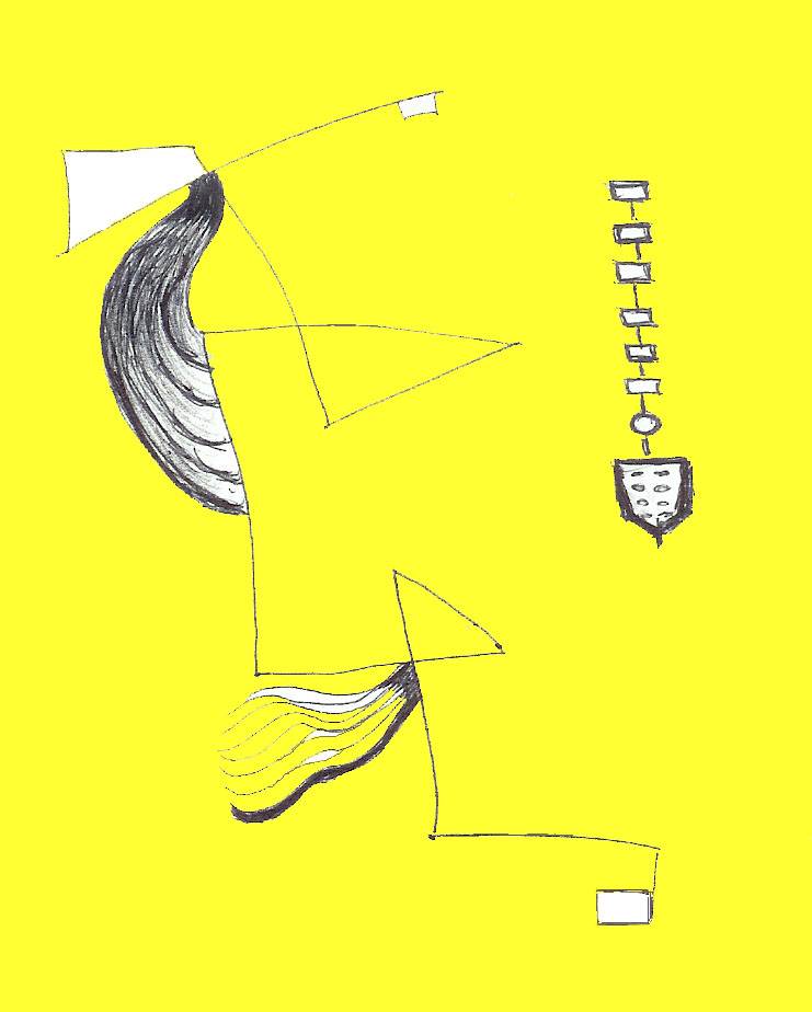
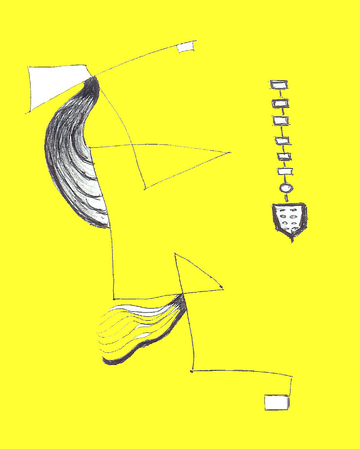
The image I have posted today is an exercise in automatic drawing developed for this week's Artwords challenge, surrealism. Automatic drawing is one of the streams of surrealism that artists like Miro used as a drawing parallel to Freud's "stream of consciousness". It is a wonderfully freeing technique and has contributed to my feeling I can be just as free with this blog. I can really see this image working as a print and hope to test that vision out soon...
+web.jpg)